 This is going to be a quick Photoshop tutorial demonstrating how to create an Abstract gaming signature. This can be used with any type of game. I've used the new Crysis game, but this can be done with any genre. I recommend a first person shooter, or similar as this kind of signature blends in well. Click on any of the image to enlarge.
For this tutorial you will need:
Photoshop or Similar
A grunge brush pack (provided below)
A suitable image (also provided)
A cool font (provided as well)
About 10 - 20 minutes.
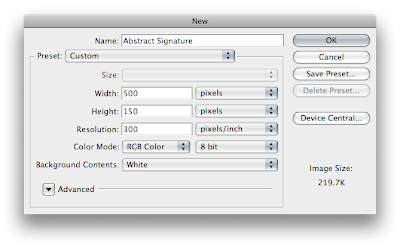
Step 1) The first step is to prepare your canvas. This can of course be any size. If a forum limits the size of an image to 200 x 50 pixels use a canvas that is 200 x 50 pixels. I'm going for a canvas about 500 x 150. This gives me plenty of space to work with. When your canvas loads set the background layer to a normal layer by double clicking on it and selecting "Ok" when prompted.
 Step 2) On the base layer set a gradient of White to Black.
Step 3) Create a new layer. Use the gradient overlay function to set the gradient from Black to Transparent. Make sure the reversed option is selected to get the black to the bottom. In the blending mode options select the blending mode of the layer to Screen.
Step 4) Grab some abstract brushes. I recommend this one from deviant art, or Google abstract brush for some inspiration. Set the brush colour to black and apply some brush strokes to the page. Just click in some random places with different brushes.

Step 5) Create a new layer. Set the brush colour to white. Apply the same effect again to the new layer.

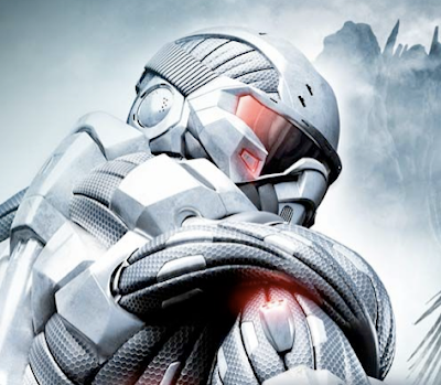
Step 6) This step is to add in your image. I've chosen the Crysis image. My original was found here. I've cropped and removed the background.

Place the image so it has good layout on the page. Corners are always very good options.

Step 7) The next step is to apply and effect to blend the image into the background. Since the image is dark and uses the black, grey and white colours i've chosen the Multiply option. This produces a very scratch effect as the layers underneath are shown through. One other good way to improve the image is add a layer mask and and use a black to white gradient to remove parts of the image gradually. I've done this on the bottom of the image.

Step 8) The final step is to add some text. I've used Kremlin. I've coloured the text black and reduced the opacity. Save this image out. You now have a cool abstract forum signature which you can use. Personally I am very pleased with the out come of this image. Click for the full version.

Please leave a comment with your creations and any further ideas.
