 You may remember if you are a long time regular reader that I did a post about the amazing designs from Shiny Binary. The author if you visit his site is all about the really detailed and the use of 3D text. I was really glad when I found a tutorial by him about how he creates his work. Following through his tutorial I found it really difficult to follow. As well as this he doesn't offer the source materials for you to try it at home, it was part of a magazine subscription. Anyway what I am going to do is produce my own version, and give you a detailed run down of how to do it, I am also going to try and make it so all people of different experiences can follow it. I have included the source materials including the final .psd in a file located here. All the images can be clicked for the full size versions.
Step 1) The first step is to create your canvas. I initially chose mine to the 4000 x 4000 pixels. The bigger is always better. I have mentioned before that the large the canvas the better the detail when it is reduced for the final output. You can change this size to suit your needs or speed of your computer.
Step 2) On the background layer add a blue gradient using the gradient tool (G). Set it using the tool bar at the top to radial. Have one colour value lighter than the other.
Step 3) The next step is to import the images from Xara 3d. Xara 3D to my surprise is a very good program for making 3D text. After you have learn't the basic steps you can create any type of 3D text you want. If you are going to use the program your self make sure your export each of the letters separately and at a different angle. If you don't want to use the program you can download the files (2k x 2k) for use in the later stages, these can be found in the source pack. I have removed the demo background from the files, for your convenience.
Step 4) Go to File > Place and select the first letter. This will place the image into the document. Press the tick in the tool bar or press enter to finalize the placement. The default will do now. In the layers palette (Windows > Layers) right click on the layer and select rasterize, this will remove the smart object status and lets use modify the layer. Use the magic want tool to select the grey and delete it. Finally move the layer into a suitable position.
Step 5) Repeat step 4 until all of the letters have been inserted, place and resize them on the canvas appropriately.
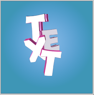
Step 6) The next couple of steps will use the layer mask option. To keep things organized we are going to group layers. Select the first layer and go to Layer > New > Group From Layers. rename the group and proceed to do this for all of the letter layers. Each layer should now be in its own group.
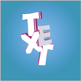
Step 7) The feature of the 3D text is to have letters being in front and behind other layers at the same time. To achieve this we are going to use layer masks. Layers masks are used to hide and unhide parts of a layer. It is similar to the eraser tool except all of that layer is kept intact. To achieve this overlapping feature select the first letter go to Layer > Layer Mask > Reveal All. Use the black brush (black hides, white shows) and delete parts of the text. Repeat the process and adding a layer mask for each of the letters. You should end up with something looking like this.
Step 8) Layer masks are going to be a big feature of these piece of work, hence why folders were added. The next step is to mask off both the side and front of the letters. The first step is to create a new layer. On this layer add a mask but set it to hide all instead of reveal all. Then use the magic want to select the white face the the letter layer. Reselect the mask layer and use a white brush to paint in the front shape. Do this for all of the layers. You should, if you look closely at the layers palette, with something like this. Repeat for all of the layers.
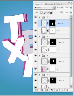
Step 9) The same thing needs to be done for the sides of the shape. This can be a bit tricky but I have found a method to enable you to complete it. Create a new layer and add your mask, as before. One the text layer use the magic wand on the background of the layer, this should select everything but the letter. Then, press shift and click on the white front of the text. Go to Select > Inverse and paint, in white, the side of the letters on the mask. Repeat for all of the layers.
Step 10) Using the layer for the side of the text, add a shadow. Use a large soft brush and lightly paint black onto the layer. If you have the clipping mask set up correctly, to should just paint on areas on the side of the text. Repeat this for all of the layers, adding shadow where areas overlap.
A clipping mask (which will be used layer and is similar to the layer mask) is not used as this would apply to the whole layer. We want something that only applies to a small area.
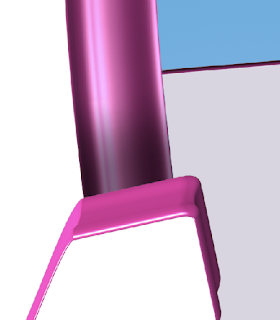
Step 11) Create a new layer above the background layer and add a small soft shadow to the background of the letters. The shadow starts to bring the piece to life.

Step 12) The front of the letters will no be coloured in. Using the layers as set up before, use the gradient tool to apply a gradient to the layer. The layer mask enables the text to only be applied to a certain area.
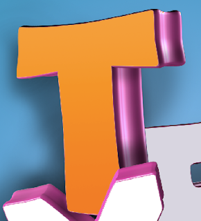
Step 13) Do this to all of the layers. Use the paint brush tool to add in small shadows.

Step 14) The final step is really up to you what you want to add to the front of the layers. The best way to do this is to create a new layer above the colour, add you content and then right click on the layer and add a clipping mask. Some places to get really cool vectors include Go Media, these sell vectors but can be used in photoshop.
Step 15) Add some background elements if you want, and you can then export your file. To export go to File > and then either Save As or Save for Web.
The more time you spend the better the final image will be.

I really love the effect, a bit later on I may spend more time and create a better one. If you want more inspiration go to the Shiny Binary website where you can see all of his master pieces. You can download the final source pack which includes all of the images files used and the final .psd, it can be found here.