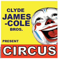
 I don't know how I came across this idea, but it was probably down to looking at all the junk posters in the shop windows around my neighborhood. Anyway, this tutorial is going to be all about those old vintage 1960 circus posters. They are really cool and very simple to do. The final piece will hopefully be in a similar style to this poster. You don't need anything fancy, all will be provided. If you want the materials you can download the source pack from rapidshare.
Step 1) The first step as always is to create your art board. I have picked A4, but you can pick any size you want. Larger is always better.
Step 2) To enable you to line things up neatly enable the grid. Go to View > Show Grid. The grid will be used to enable you to line up a couple of the boxes and text.
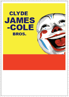
Step 3) Using the square rectangle tool (U) set the fill to yellow and the stroke to white. Under the stroke palette, (Window > Stroke > More Options (Little Arrow Thing)) set the stroke to the inside, colour to white and size to 20 pixels. Draw a rectangle that takes up just under half of the page.
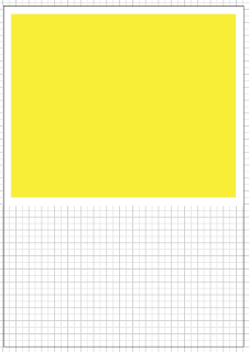
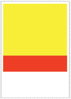
Step 4) Using the rectangle tool again, set the stroke to nothing and draw a rectangle underneath the yellow rectangle.
Step 5) Finally add a white background with the rectangle tool that covers the whole canvas. Right click > Arrange > Send To Back. This white bit is done last so the grid can be used to gauge how things should be aligned.
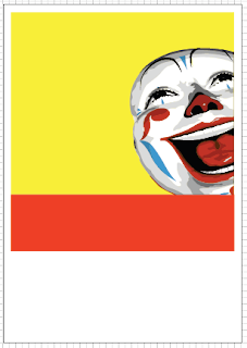
Step 6) The next step is to use our clown. I couldn't find a free vector or bitmap image to use but I did find a decent on deviantart that was good enough for this tutorial. I have vectorized it and edited it slightly to fit. You can find the one I have used in the source pack.
You need to insert the clown and transform and move the image until it suitably fits. Align it up to the edge of the yellow. I was a bit wild with the eraser and he happens to be missing an ear.
Step 7) Quite a lot of this post is text heavy. The font I have used it the sans-serif Arial Black. Insert some text and use the paragraph options to change some of the values. The paragraph options are accessed by clicking on the word character by the font selection in the tool bar. Use the appropriate box to change the line height to squash the text together.
Step 8) Continue adding the text. Make the circus text extra bold by changing it to white and adding a black stroke of about 6 pixels.
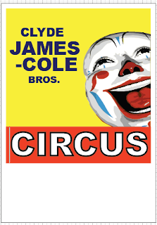
There really isn't much to explain. Just look at the images for examples of what I have written. Use the line height tool as mentioned to adjust the height of the lines to get the text to fit.
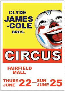
Step 9) The final step is to just finish the page off. Add some stars and a box to highlight the child tickets. As well as this in very small text I have added a copyright. They are present, it is just a little feature. I have also added "present" in the yellow to fill up the space, although it does seem a bit lost.
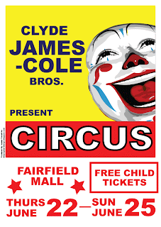
I hope you have enjoyed this tutorial. I enjoyed making it as always. If you want my final image you can find it in the source pack.