Hey There
It is
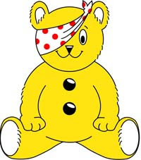
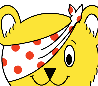
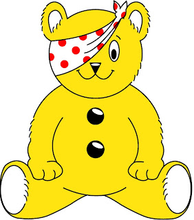
Children In Need on Friday, one of the biggest fund raising events in Britian, and I decided, to improve me Illustrator skills to copy the ever famous Pudsey Bear, my final version show right. This is the traditional Pudsey that has long been a favourite of mine. Not the new fangled one that the
BBC is using the year. If you visit the
Children In Need site you can view their new logo.
All this tutorial will use it he basic tools within Illustrator. It could take quite a while depending on you skills. But remember this. Even if it looks rubbish it is still good practice. All the images you see below are click able to see there full versions.
The plan is to draw the outline by hand using a fine stroke. Duplicate this layer, add the fill and then add the stroke. This is necessary since the logo has some open edges and this is the most simple way to do it.
Step 1) The first step is to create your canvas. I like a nice big canvas so chose a size that is suitable. Name and Save your work before you move on.
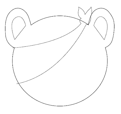
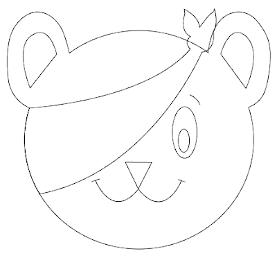
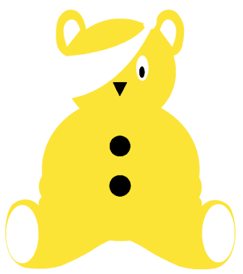
Step 2) Open up the Pudsey bear logo. I've used the one below as my starting point.

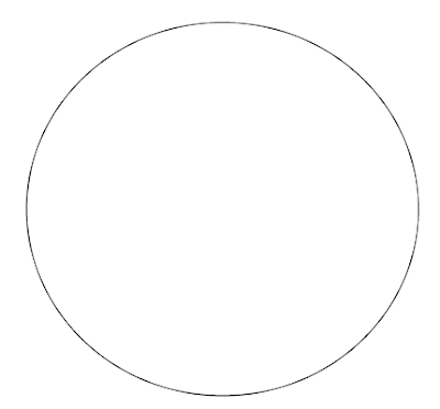
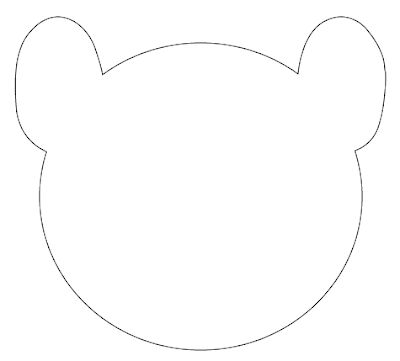
Step 3) Begin by drawing the head. Use the ellipse tool (l) to draw a circle with a 1 stroke. The using the Selection Tool (V) squash the head every so slightly be moving down the top point.
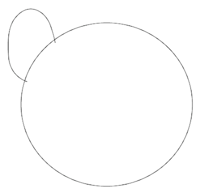
Step 4) Bring out the path tool by pressing P or using the icon. Draw and ear in the following shape. Over lap the edges ever so slightly. The edges will be removed in the next step.
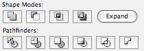
Step 5) We are now going to use the Pathfinder menu. Open this from Window > Pathfinder. The path finder pallet enables you to join paths together into one complete path. Using this menu press the Add Shape Area (the furthers left). Then click expand. Make sure you have both paths selected.
Step 6) Repeat this step to draw the second ear. You can either draw it by hand, or undo, and copy and paste the first ear path. If you have copied and pasted, select the new path, right click > Transform > Reflect > Vertical.
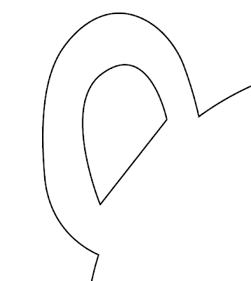
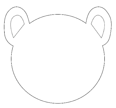
Step 7) Moving on. Select the path tool again and draw the inner ear shape. Make sure the path is closed by clicking on the first path point when you have completed the shape. I reccommend doing the straight line first.
Step 8) Do this the right ear. You can, if you want, copy > paste > reflect.
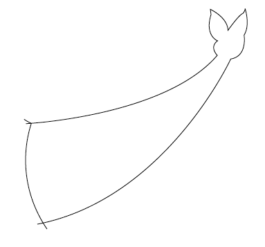
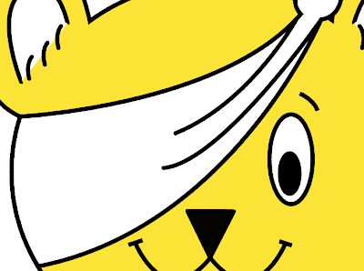
Step 9) Step nine and ten becomes a little tricky. Use the path tool once again, to draw the scarf. Make sure you have included the small details in the bow. Go over the line around the head. Do no close this path, yet.
Step 10) To close the path, so it is easier to colour, first select the head shape. Copy and paste this onto the art board. You should have two copied. Align this new layer using the selection pointer (black arrow, V). In the pallet menu find the first head shape. It should be at the bottom. Click the empty space by the eye to lock the path, then click the eye to make it invisible.
With this new layer (it should look just like before). Select the path tool again and click very close, on the exiting path, to the scarf. This is to add another point. Do this on both sides. See the image below for an example. Then using the Direct Selection Tool (A) delete all the points until you end up with something that looks like the image below.
Ideally the points/ends should be closer together. Move the points about until they are very close and then join them together using the Object > Path > Join. Select the first option if prompted. If you are successful you should have a complete path for the headscarf.
Step 11) Make the head visible again and remove the lock.
Step 12) Add in an eye using the Ellipse tool once more. Use Selection Tool (V) to adjust the position and shape. Add an eyebrow (not shown below).
Step 13) Use the Polygon tool to draw the nose. Use the up and down keys to change the amount of sides before releasing the mouse. Draw in the the mouth using the path tool.
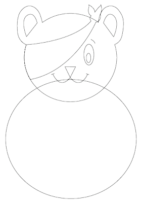
Step 14) Moving onto the body. Lock the head so you don't inadvertently make any changes. Use the ellipse tool once more to draw a circle and slightly squash it. I've done this on a new layer for ease of use later on.
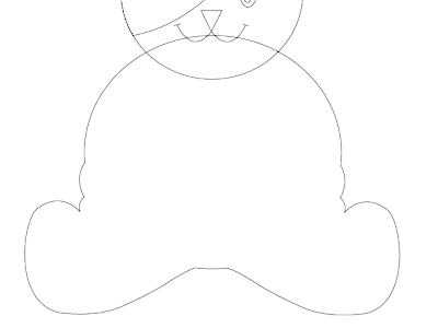
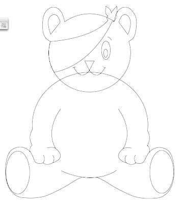
Step 15) This is sot of two steps in one, because I forgot to take a picture when producing the tutorial. Using the pen tool once more, draw the rough shape of the legs. Follow the original image closely. This is mostly the side of the arms and legs. Notice the random bump that is present in the arms. Copy and paste this new path to the other side. Use the path finder tools to make this one whole path. Take your time. The more time take the better the image.
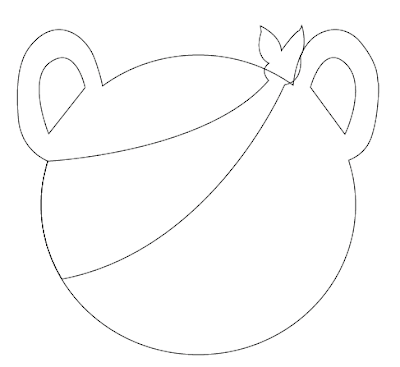
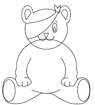
When you are done you should have a bear that looks like the below image.
Step 16) Draw in the rest of the arms with the path tool.
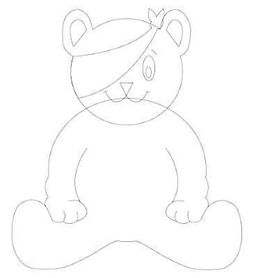
Step 17) Finish off the body with the two ellipses for the feet and the curve to mark his belly.
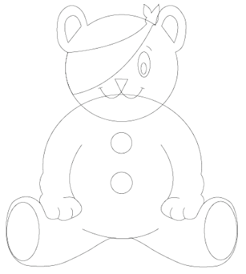
Step 18) Finish off the shape by drawing in the buttons. The shape is now done.
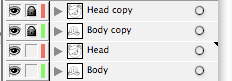
Step 19) We are now going to colour in the bear. Copy the layers (i've named them). Lock the top layers so they cannot be changed. Hide the top layers. These will be used later for the outline.
Step 20) With the bottom layers. Remove the stroke and add a fill. The colour I have used is RGB #FFE412.
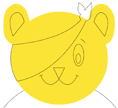
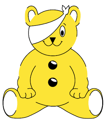
Step 21) Do this for the rest of the body adding in the colour values as necessary. Remove by pressing delete the lines that are not needed. You should have an image that looks like this.
Step 22) A bit of detail at this stage. Add the white highlights to the layer using the ellipse tool.

Step 23) We now want to create a very thick outline. Lock and hide the coloured layers you have just been working on. Unlock and show the layers that will be used as the outline. Press Ctrl/Cmd + A to select all of the paths. Use the Stroke menu (Window > Stroke) to increase the thickness. Have it around 4-5px. Make sure all of the edges are rounded. If you want to get to the extra options click the arrow in the top right to show the extra options.
Step 24) Some parts of the image is removed. To achieve this it is quite simple. Select all of the paths again. Go to Object > Path > Outline Strokes. This will make all of the stoke fill paths. Make sure you have the thickness set correctly.
Then using the eraser tool (Shift + E) erase parts of the paths. These are at the following places in the image below. I've re-shown the fill layer.
Step 25) Looking good. Using the pen tool once again, have it set to the same stroke as the original outline and draw in the fur bits. I copied and pasted some of the paths to save time.
Step 26) Final steps to complete. Add in two more paths for the scarf. These come out of the edges like so.
Step 27) The final step is to add in the red dots. Use the ellipse tool again, with the fill set to red and draw in the circles. Copy and Paste to make sure they are the same size. Order the circles in the appropriate layer so they are underneath the lines. Use the eraser tool to remove the edges. It may be appropriate to lock some layers.
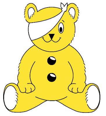
Admire your work. Looks very cool when done. The more time you take the better it will look, and more close to the original.
If you are stuck please leave a comment and I will try and help out. If you wish to donate some one to the Children In Need Fund, to help out Children who are in need (duh!) please visit this
online order form to make your donation. Please leave me a comment if you do. Ill be donating later today (or on friday, when the show is one BBC 1).
 Step 2) The next choice to to select the rectangle tool. If you want to use another shape you can. I'm cropping my piece of work to the size of the art board. To select a size of a shape in Illustrator select the tool and click on the art board, you will be given the following option to change the size (this can be used for nearly any other shape, line etc)
 Step 3) To successfully align the new shape select the Selection Tool (V) at the top on the tool bar select the Align to Art board Button (the symbol on the left) this will bring up a couple of options. Select both of the middle buttons to align the rectangle in the centre of the art board.
 Step 4) Open up the pathfinder palette (Window > Pathfinder). One very important tip to note is that strokes cannot be cropped. To make every thing into a shaped path, press Cmd/Ctrl + A and then select Object > Path > Outline Stroke. This will make everything into a shape.
 Step 5) Press Cmd/Ctrl + A to select everything and press the crop button in the pathfinder (3rd from right). This will crop the work to the box.

 If you have any comments or questions, please leave a comment.


