Birth of a Hero

Hey

I have not been able lately do do any really good design work but I have found a really cool font that I want to use in some future project. Its called Birth of a Hero if you didn't work it out from the title.

Birth of a Hero
From the picture above its a very grungy font, but at the same time its still very uniform and geometric. Really cool. You can get the file here if you want to download it. Its availble for Mac and Windows.

Birth of a Hero

Wallpaper Wednesday - Double Post

Hey there,

Since I haven't been posting much on this blog lately since my life has been so busy with work I thought I would give you 2 wallpapers to use this week. These are really cool and I love them both.

The first one is a 70's style alien vector image thing. I don't really no what to call it but it does look cool. You can find the original here. You can click the image for the full version.

Wallpaper Wednesday
This second image is of a completely different take. I have not found many good 3d images to use as wallpapers but this is so funny. The original is found here. I just love this image so much. Click for full version.

Wallpaper Wednesday
Till next time good bye.

Pixelmator Is Here.

Hey

Photoshop is a great program but it may have a competitor in the cheaper market. This new cool looking program is called Pixelmator and is availble for $59 and it could compete with the big daddy that is Photoshop.

Why is it so cool. It just seems for graphically oriented. For example it uses the GPU instead of the CPU to do the graphics rendering. This has its push and negative points but generally runs well on my Mac Book Pro, and is very is responsive.

Pixelmator If you case above it uses black a lot. Thats the drag and drop installation of the program. I fyou look below you get the welcome screen. It is normally a lot darker, but taking the image seems to have changed what the image looks like.

Pixelmator
Generally it looks good and is fun to use. You can see the darkness of all the palettes that the program has to offer. It is quick and simple to use but like any new programs it is new so there are some bugs.

Pixelmator The above image didn't take me long to do. Although it is a bit rubbish it is fun to work with so I might give it a try. You can find it here on Pixelmators website.

How to add a Wiki to your Blackboard course

Wikis are shared web spaces (web pages) that students and instructors can post material to and edit together collaboratively.

As the instructor, you can decide who in your class is allowed to edit and add content to a Wiki, and which participants in the class are allowed to view the wiki. You can use a Wiki to have students collaborate on a document, do a team project, produce a group report, or any other exercise in working together.

Here is how to add a Wiki to your course site in Blackboard:


Step 1 - Choose a content area

First toggle Edit Mode at the upper right of your course to "on"


Click a content area in your course menu on the left in which you would like the Wiki to appear (you could choose "Course Material" or "Documents" for example).


Step 2 - Add the Wiki

Use the "Add Interactive Tool" button and click on "Campus Pack Wiki".


Choose "new" Wiki and click the Submit button.

Give your Wiki a title and choose grading options:


Step 3 - Add a page to the Wiki

Use the "Add New Page" button to add the first page to the Wiki.  Use the "Permissions" settings at the top to decide which of your students or groups will have access to the Wiki to edit and/or view.


Step 4 - How students can edit the Wiki

The Wiki will appear in your course under the section you chose in step 1. View or edit the Wiki, students click the View link


If they have permission, students can edit the current page of the Wiki by clicking "edit" on the right side of the page. They can add a new page to the Wiki by clicking "Add New Page".


That's all there is to it. Your Wiki is now ready to use.

Aperture Tutotial - Cropping Photos - Part 13

Hey

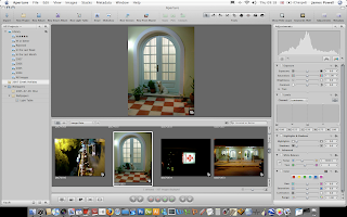
Cropping photos is easy in Aperture. Like most things it only involves a couple of clicks and doesn't take long to do. The first thing you need to do is open Aperture and find a photo you need to crop.

Aperture Tutotial - Cropping Photos
The next step is to select the crop tool. This is located in the tool bar.

Aperture Tutotial - Cropping Photos
Drag a box around the part of the image you want to crop. The lighter sections will be kept. The darker sections will be removed.

Aperture Tutotial - Cropping Photos
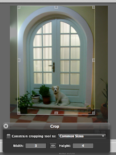
The floatable HUD does have built in options for preset sizes. For example if you look at the image below these are all the sizes you can use. The select box changes to which ever size you select.

Aperture Tutotial - Cropping Photos
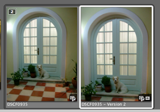
Pressing enter or selecting another tool crops the image and create a new image in the stack.

Aperture Tutotial - Cropping Photos
This tool is easy to use and you can crop all your image in no time. You can read the rest of the series here.

Wallpaper Wednesday - Shipwreck

Hey

Sorry for the lack of updates. An Aperture tutorial will be here tomorrow I have been really busy at school. Any way if you want this weeks wallpaper you can cast your eyes down to the image below. Again this was taken on my holiday in Greece and it was one of the ship wreaks. It's made out of iron and was deserted for a long time. You can click the image for the full version.

If you are interested now is the best time if you want to buy a Mac and iPod since Apple are offering there back to school promotion. You can check it out here.

Vector Digital Maps To Download

Hey

I like maps and vectors so whats better than vector maps to download. The ones i've found are amazing quality and are at a very reasonable price of $50. For example this pack includes maps of countries, American states and a world map. Nearly all the maps are availble in either Illustrator Ai, Gif, Jpg, and editable PDF. These are really high quality and are either in full colour or single colour as shown below.


If you think this is a really cool product to buy because I can think of hundreds of uses for this product. You can download this product here for a limited time only price of $49.

Happy mapping.

Aperture Tutorial - Rotating Images - Part 12

Rotating images in Aperture is as simple as two clicks. Ill show you the simple steps needed so you can do it every time.

The first step is to find the rotate button. Its located in the toolbar at the top of your screen. Click either of the two on the right. You can also press on of the square brackets ( [ & ] ).

Aperture Tutorial - Rotating Images
Notice the images in there slanty uncorrected position.


And after a click or 3 the image are the right way round. You don't have to change the tool to change the rotation of the image just keep clicking and the image will keep rotating.

Aperture Tutorial - Rotating Images
Thats was a quick tutorial. There will be another one tommorow. You can read the rest of this series here.

Drawing Homer Simpson In Illustrator

Hey
Homer Simpson
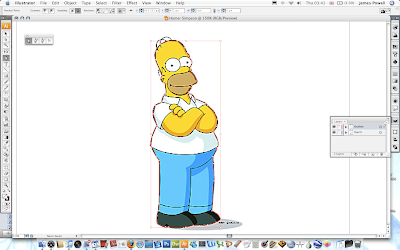
Illustrator is a great program. It offers so much versatility in creating vector images. Hence why it is the top vector program out there. As a beginner to this program I want to share with you a tutorial that is simple to follow that you can use to draw Homer Simpson of The Simpsons. It is really easy to do but it does take a long while if you want to get it correct and good looking. What we would hopefully be working towards is something shown on the right. That image is lifted directly out of I had made. All the included colours will be given although you can download the swatches from the source file if you want to load them directly. If you want to see any of the image screen shots full size please click on them.

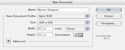
Step 1 is simple create for canvas and suitably name it. A size under 800 x 600 is perfect because the source file we will be working on isn't the best of quality. Remember to save the file once as you click OK. You don't want to lose all of your work because you didn't save your file.
Drawing Homer Simpson In Illustrator
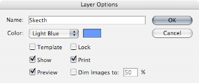
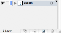
You next need to create a layer for the background image that we are going to trace. Rename the existing layer (If you need your layer palette up go Window > Layers) and naming it something useful (and spelled correctly (D'Oh)). The next step is to lock the layer by checking the tick box. Locking the layer prevents you from moving it are changing any of the attributes when working.
Drawing Homer Simpson In Illustrator
The next step is to copy and paste or place the image below onto this layer. You can either resize it to a large size if it is to small or leave it as it is. Drawing Homer Simpson In Illustrator
You should have something that looks like this. When you lock the layer there will be a small pad lock by the eye. If can always click and unclick the pad lock to edit and change the layer as necessary. This will be done numerous times to different layers.
Drawing Homer Simpson In Illustrator
The next step is to start drawing. Use the Pen tool (P) and set the stroke to about 2. Change this depending on the size of your image. One thing to remember is that a thinner line will be added on to the image later.

Drawing Homer Simpson In Illustrator
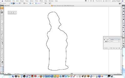
Once you have selected the pen tool create a new layer. Name it outline. The carefully draw around the outline of Homer. Make sure that you adjust the curves as needed with the White Pointed Tool (A).
Drawing Homer Simpson In Illustrator
Once you have spent some time carefully adjusting the image you should have a good outline. Through out the creating of this tutorial I was always going back and changing the outline to look both good and fit to the original sketch.
Drawing Homer Simpson In Illustrator
You now need to reduce the stoke size of the brush. The inner lines are smaller and thinner due to the detail.

Drawing Homer Simpson In Illustrator
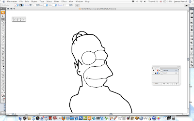
Again, follow the sketch outline using the 1 stroke brush. One thing to note is that the left eye is better if you use the ellipse tool. It is easier to get the round shape.
Drawing Homer Simpson In Illustrator
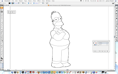
Continue down the body tracing the image as necessary. The more time and effort you put into getting all the lines to match up is vital. The image does look better in the end. Remember to add in the backs of his eyes.
Drawing Homer Simpson In Illustrator
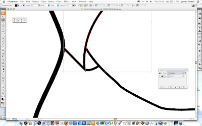
One thing that might become apparent when drawing your image is problem areas due to the edges of the brush strokes. The one below is shown be his sleeve opening. This can be solved in an easy way.

Drawing Homer Simpson In Illustrator
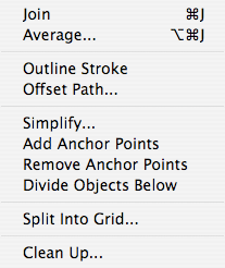
Go Object > Path > Outline Stroke. The converts the single line to a block shape. You can then move the points by hand to match up and cover up any errors.
Drawing Homer Simpson In Illustrator
You can then move the points and make the sleeve look better.
Drawing Homer Simpson In Illustrator
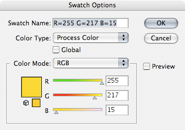
The next step is to start creating the coloured skin. Homer Simpsons skin is defined by the colours below. You can use the colour palette included in the source pack.
Drawing Homer Simpson In Illustrator
Begin by making the colour the yellow you just created and the stroke to 0 or the colour invisible. Use the pen tool.

Drawing Homer Simpson In Illustrator
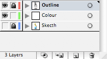
Create a new layer. Name it colour. Lock the outline layer so you can't change it while you are working on the colour layer.
Drawing Homer Simpson In Illustrator
Go around the outline of skin with the pen tool. You don't have to be to careful when you make the points as along as all the skin is filled in and there is no white bits left.
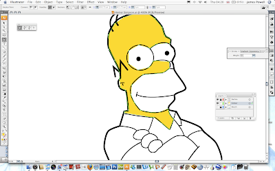
Drawing Homer Simpson In Illustrator
You need to continue with other parts of his skin. The beard is RGB 238, 205, 128. You can download the colour values from the source pack.
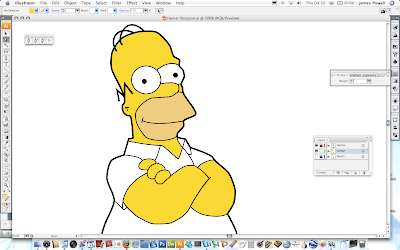
Drawing Homer Simpson In Illustrator
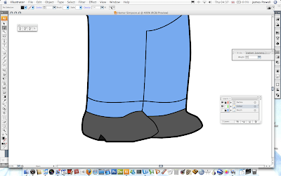
The next step is to move onto his feet and finally on to his shoes. The blue used will be slightly different and darker to the original used in the sketch. The colour values are shown below.
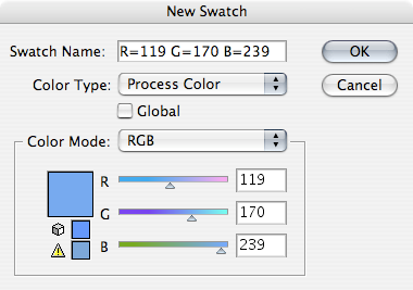
Drawing Homer Simpson In Illustrator
He is starting to come to look good now.
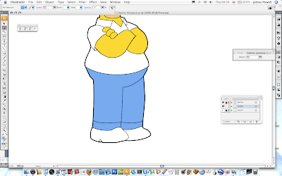
Drawing Homer Simpson In Illustrator
The final part of block colouring is to do his shoes. These are dark and use the colour values RGB 85, 85, 85. Again use the pen tool and go around the shape of his shoes.
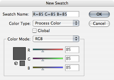
Drawing Homer Simpson In Illustrator
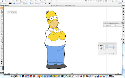
They are coloured in a look like so.

Drawing Homer Simpson In Illustrator
He really does look cool at the moment and hopefully should yours. Give yourself a pat on the back for you good work. But you can make it even better with some shadows.
Drawing Homer Simpson In Illustrator
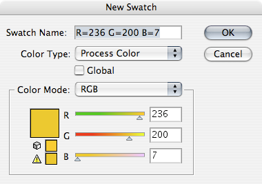
The shadows use the same basic colours but are darkened. These colours are not in the source pack so you have to make them yourself.
Drawing Homer Simpson In Illustrator
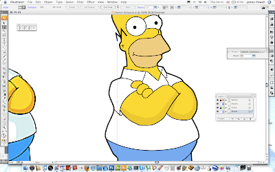
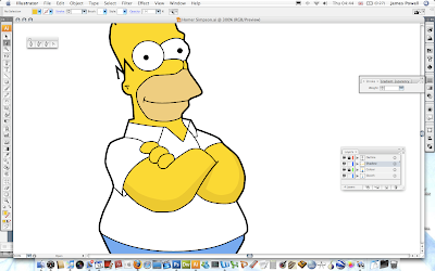
These is where your artistic talent comes in. Use the pen tool again with no stroke and the fill set to the shadow colour. Make and out line shape of the shadow and use the reference image as a source. I've moved the sketch image off to the left so I can easily refer to it. Use a new layer if you want to.
Drawing Homer Simpson In Illustrator
Continue around all parts of the skin.
Drawing Homer Simpson In Illustrator
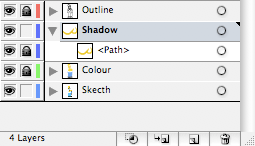
If you look at the layer palette below i've locked all but the shadow layer I am working on. By the way the path under Shadow shouldn't be locked. I clicked the button by accident before taking the screen shot.
Drawing Homer Simpson In Illustrator
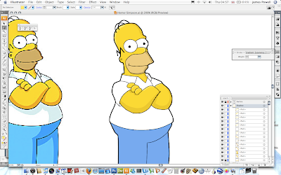
Although from the screen cap it may be difficult to notice all of the skin has a shadow.
Drawing Homer Simpson In Illustrator
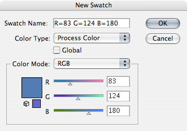
Continue now with the shadow of the trousers. The colour shadow is RGB 83, 124, 180. Again create a shadow by following the sketch image as a source.
Drawing Homer Simpson In Illustrator
The shaodws really bring the image to life and they look a lot less 2D.
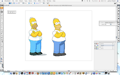
Drawing Homer Simpson In Illustrator
You need to do the same with the grey for his t-shirt. I've used the default light grey that is included with the colours with Illustrator.
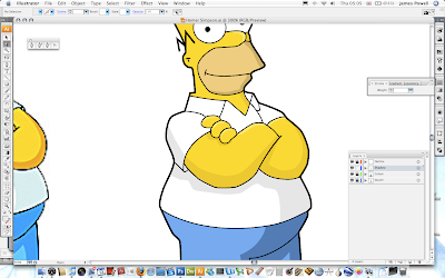
Drawing Homer Simpson In Illustrator
At this point my homer looks very similar to the original copy.
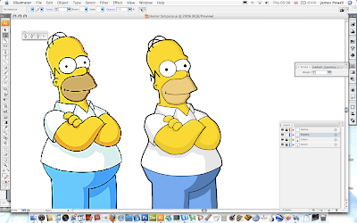
Drawing Homer Simpson In Illustrator
You need to do again the shadows on his feet. I've used another of the default greys.
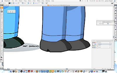
Drawing Homer Simpson In Illustrator
All you need to do now is finish off by sorting out any stray lines. I've added some text for extra effect (and people no I did it). As well as this there is also a shadow. This again uses one of the greys built into the colour palette.

Drawing Homer Simpson In Illustrator
Now this image is by no way perfect. There are little blips that could be sorted out but other wise it is really cool. Please leave your comments below.