Hey
I'm a bit bored with giving you a tutorial on the interface in Aperture, so i'm going to give you a quick tutorial on modifying photos and what happens when stuff changes in the adjustments window. If you need a copy of Aperture please go to the download store to purchase a copy.
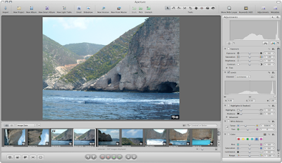
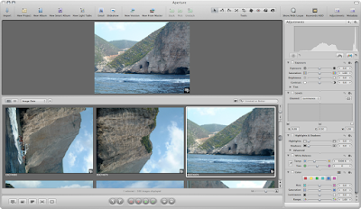
Any way moving on, i've hidden the projects pane from the window menu. I've picked a suitable photograph that could perform some minor changes.
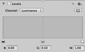
One of the biggest tools for changing photos is levels. This tool changes the levels (well duh) of a photograph, and is good for making a photo look better and fuller colours. One tip is to make sure that your monitor is accurate in its colours. A wonky coloured monitor will not help when adjusting images.
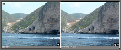
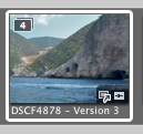
Once you make any changes or select a check box within Aperture another copy will be made. This is put into a stack (more explained in later tutorials). This will be visible in the image browser.
If you notice in the top right hand corner a number will be displayed, this is due to the amount of images in a stack. Every change to the master will great a new copy and increase the stack number.
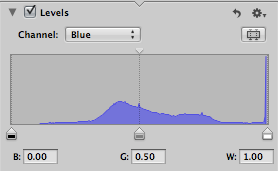
If you notice you can change the levels and although it makes subtle differences these are visible.
If you use the compare option you can compare the different images in the stack.
As you can see the more changes you make to the master the more copies in the stack that are created.
Within the levels (which is one of the best tools) you can change the individual colour properties, the more changes you make the more you can modify the image. All changes are kept (unless you delete the version).
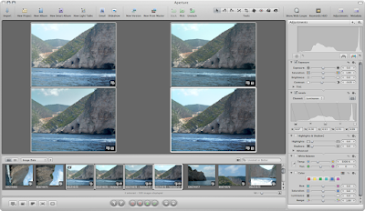
Again is you use the compare option, selecting 4 images, you can visibly compare the changes you have made. Click the image for the full size version to sheet what has happened.
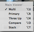
The view options in the bottom left corner in the control bar depicts what options you can see in the viewer.
As you can see after you have adjusted an image you can promote and image which is picked (more on stacks in the next tutorial)
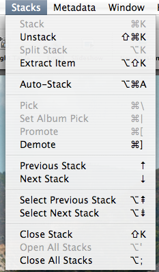
If you want to close the stack so you don't have hundreds of the same image visible use the Stacks > Close Stack option.
The four images have now become one.
Now I no that this was a bit brief but I will explain all the different options that you can do to an image in later tutorials.
Aperture Tutorial - Metadata - Part 6
Hey
This is a continuation of the Aperture tutorials and it is moving onto the Meta data pane. This is one of the main pains you should use for tagging your photographs. Many times it has helped in finding a photo after I have used one of the features located in this pane.
You can usually find the meta data pane in the top left corner with the adjustments icon. If its missing you can always go to Window > Show Meta data.
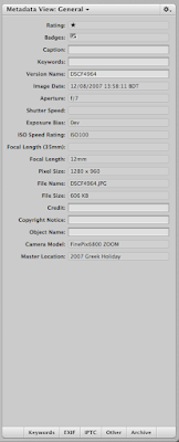
Usually this is the default view. All of the data which you can't change is unclickable. Any data which you want to change you can use the text boxes.
The ratings and badges options are at the top. Ratings you use if with the ratings tool bar shown in the last tutorial. The badges are added automatically. I will explain in later tutorials about badges.
Captions and keywords are very very useful for finding your photos in keyword searches. I suggest you use them if you have hundreds of photos.
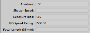
Most of the data you can't change is written into the EXIF data by your camera. In my case the version name is the file name of the photo.
All the extra information which is taken by your camera is shown as applicable. It's useful to have this data some times when you modifying photos.
Again going down the list, extra information such as image size. Cropping a photo would of course change the pixel size.
As you can see the text boxes allow you to add more information to your photo graph.
Again more information is added by the camera to the EXIF data. The master location is where you photographs are added.
If you think that all that data which you can add is over whelming you can add a lot more. The buttons at the bottom bring up a pane so you can add a lot more information.
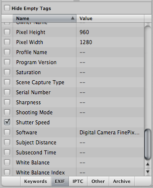
For example if you click the EXIF data button a whole load of options appear, which you can add, customize as you see fit.
As you can see meta data is a really full tool which you can use to add information to your photos. Use it to organize your photos effectively.
Wallpaper Wednesday - Old Monks House
How to add a Blog to your Blackboard course
Blogs are journal-like web spaces that students can post material to. As the instructor, you can decide who in your class is allowed to post content to a blog, and who is allowed to read the blog. You can use a Blog to have students post a journal, upload files, upload homework, text, pictures, or even sound files.
Here is how to add a Blog to your course site in Blackboard:
Step 1 - Choose a content area
First toggle Edit Mode at the upper right of your course to "on"
Click a content area in your course menu on the left in which you would like the Wiki to appear (you could choose "Course Material" or "Documents" for example).
Step 2 - Add the Blog
Use the "Add Interactive Tool" button and click on "Campus Pack Blog":
Choose "new" Blog and click the Submit button.
Give your Blog a title and choose grading options:
Step 3 - Add an Entry to the Blog
Use the "Add New Entry" button to add the first entry to the Blog. Use the "Permissions" settings at the top to decide which of your students or groups will have access to the Blog to make entries and view it.
Step 4 - How students can access the Blog
The Blog will appear in your course under the section you chose in step 1. To view or add entries to the Blog, students click the View link
If they have permission, students can add entries to the Blog by clicking "Add New Entry" on the right side of the page.
That's all there is to it. Your Blog is now ready to use.
Aperture Tutorial - Adjustments Interface - Part 5
Hey
I'm continuing on with my epic tutorial on all thing Aperture and this time it is the round of adjustments pane on the right hand side. This quick tutorial is going to tell you what each of the knobs and dials does. In a couple more lessons I will be going onto how you can use this to modify for photos. You can click any of the image to enlarge.
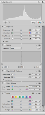
The adjustments pane is located on the right hand side of the window. If it is not visible you can go Window > Show Adjustments. This pane should open to the right in the Aperture window. You can use the flippy arrows to show or hide parts of the panes.
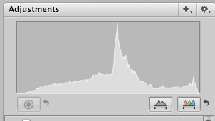
At the top of the pane is the histogram. This is used to view the levels of the colour values in any given photo. It is very useful if you want to remove some dark or light edges off the colours.
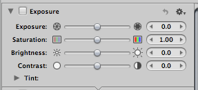
The exposure panel is designed to change the values given in a RAW file. These are the fine controls for an image quality for exposure, saturation, brightness, and contrast.
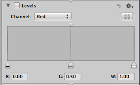
The levels pane is very important as this controls the histogram at the top. You can change the levels for every colour value. A tool to learn how to use.
The highlights and shadows works again with the levels pane and controls the light and dark values of an image.
White balance is a very useful tool for making sure the white point of an image is correct and you get true colours. This pane is used for changing this value in RAW files.
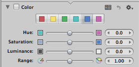
Colour pane is a tool that is useful for changing a specific colour value. For example if an image is to red, you can use the red colour change the hue, saturation and the other values to get this to what you want.
This is the end of this tutorial, I didn't have much time to complete this so I am sorry it is short. You can easily view the previous tutorial by visiting this link. If you need to purchase a copy of Aperture please visit the Apple Store for more information.
Aperture Tutorial - The Image Interface - Part 4
Hey
I'm continuing on with my tutorials of Aperture and this time I am going into detail on the Image Interface where most of your work will be spent in organizing photos. The main use of this is to see all of your photos. I will go into detail on all of the features of each of the buttons. You can click any of the images to get the full size. You can see the rest of the series here. If you haven't all ready got your copy of Aperture please visit the Apple Store for more information.
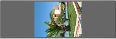
The photo below shows you the main interface. This is the middle section of the Aperture screen when you open it up. It is designed so you can quickly and easily view your photos so you can modify them and export them to external projects.
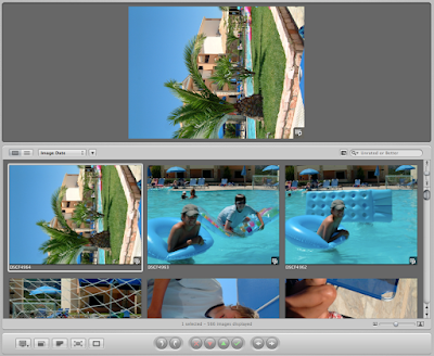
The middle section is split into two sections, the top is the viewer. This is so you can view your image. You can have as many images as you want to view in this section as you want. It isn't shown off in its best glory but it is very useful.
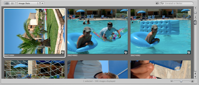
The bottoms section is the browser. This area is designed so you can browse through all of your photos. Selecting more than one image will place additional shots in the view above.
One of the other areas of the image interface is the pane at the bottom. This is used to rate and position images on screens. I will go into detail on this later.
Viewing the data about your images is important to photographers. In the top left hand corner there is an option to view your images in thumbnail view (left) and list view (right)
Clicking on this image changes the browser view from the thumbnail view to a list view. This gives you a lot of information that you can use to sort and view about your photos. This enables you to see all your photo (if you want to sort them) with a specific focal length, ISO, shutter speed etc.
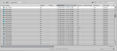
The data shown in the list view goes hand in hand with the sorting options. This again is located with in Aperture about the browser pane on the application.
The drop down box gives you a lot of options for sorting you images.
Each option (Image Data, Rating, Version Name, File Name, Keywords, Size, Orientation, Pixel size) when clicked will order the thumbnails in the order specified.
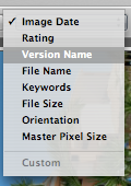
If you want them in reverse order clicking on the small arrow next to the drop down box can switch the order of the images.
Some times, a simple ordering can be difficult to use and find an image you want if you 10,000 images to sort through. This is where the search option box comes in.
Similar to spotlight within Mac OS X, it works in a very similar way.
This is located on the right hand side of the browser pane and contains to options. A filter result and a search box.
The filter box which balloons out, can give you specific rules to work with. Similar to smart play lists within iTunes you can add or take away as many rules you want to filter out the images. Clicking the close button will close the filter balloon.
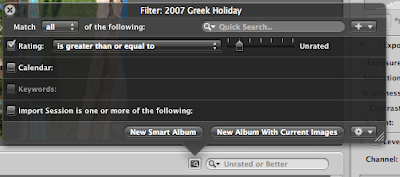
Some times the best (and most interesting) way to view you images is to scroll through them. And the Aperture gives you two ways to do this. An traditional scroll option, and an auto scroll.
The auto scroll works in a way similar to a normal scroll bar. Dragging the bar up or down will scroll through the images in that chosen direction, the further up or down you move the bar the faster it scrolls. Letting go of the bar the scrolling stops and the bar returns to the center.
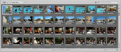
The thumbnails which you view can be changed in size. This can enable you to view as many or as little images you want within the browser interface. This is done in Aperture through a simple slider in the bottom right of the interface.
Pushing the bar all the way to the smaller icon or left hand side gives you a lot of thumbnails to pick through.
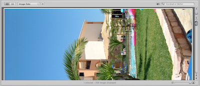
All the way to the right and you get one massive thumbnail.
The bottom of the browser interface is important, it offers all the buttons to rate and views you images on multiple screens.
These 5 buttons give you access to how you images can be viewed on screen and are pretty powerful if you have multiple monitors.
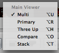
Clicking the left most button gives you access to how the multiple screens behave. Each show a different part of the interface. The best way to find the one you like is to click through the options. Three up shows three images on screen, Compare is an easy way to compare images, Stack shows all the images in a Stack (explained in another tutorial).
The next button from the left is the zoom button. Clicking this will make the selected image its full size and will bring up a tiny option to move the view about. This is useful for zooming on an area of detail.
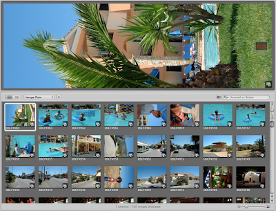
The small zoom box on the image. The red part shows what is visible on screen.
Continuing along the row of buttons, this one shows the master image for a stack. If you have made a stack that has 20 images inside it, clicking this button will show that master image.
This image takes you into the full screen mode of the application. In later series I will show you the advantages and tools of the full screen.
I am not 100% sure what this button does. Clicking it on my computer doesn't do anything. I personally think its used on multiple monitors.
One of the tools of Aperture is to rate and promote images. An it is done with this tool bar at the bottom of the browser.
These buttons are designed to rotate images either left or right. Simple and effect to rotate images.
If you have take 100's of image not all of them will be worth of printing or taking to a client or external source. These buttons are to promote or demote images.
The cross gives a photo a rejection badge, the red down arrow removes a star. The green up arrow gives an image a star (up to 5). The green tick gives an image 5 stars.
Finally the last arrow is to move to the next image within the browser pane.
Till the next tutorial which again will be in a couple of days. Keep playing with Aperture and have fun with photographs.
Subscribe to:
Posts (Atom)