Showing posts with label Image. Show all posts

Post-it Note Doodles

Hey

I get a bit bored some times. Ok well all of the time, and I end up drawing and Post-its. Theses are some of the best I've come up with as most end up in the bin. Click any of the images to enlarge.

Math Symbols

Post-it Note Doodles
Dam Missing Post-it

Post-it Note Doodles
Lots of curls

Post-it Note Doodles
More Curls

Post-it Note Doodles
Pipe City

Post-it Note Doodles
Weird Men


Creating a Web 2.0 Logo From an Exisitng Logo

Hey

This tutorial is going to show you how to change any exiting logo into a cool Web 2.0 style logo. This is with cool gradient styles, reflections and interesting text.
For this tutorial you will need Photoshop or similar and and an existing logo (or the one provided). The Web 2.0 pack may also be useful to use, you can download it here. At any of the image you can click on them to see the full sized image.

If you are all ready and seated, lets begin.
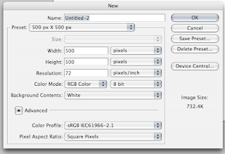
Step 1)

The first step is to create a canvas. I use a default 500 x 500 pixel size. A large size should suffice.
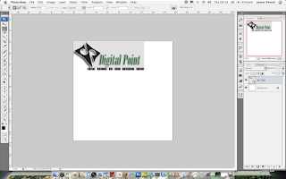
Creating a Web 2.0 Logo From an Exisitng Logo
Step 2)

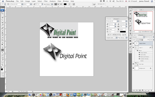
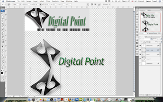
Once you have your canvas find you suitable pre Web 2.0 logo. I've used Digital Points logo. Although any similar style logo would do.

Creating a Web 2.0 Logo From an Exisitng Logo
Step 3)

Place or copy this into the canvas. This would be used as both a reference and suppling some of the shapes used.
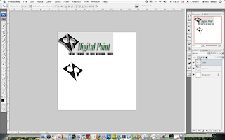
Creating a Web 2.0 Logo From an Exisitng Logo
Step 4)

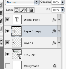
Use the magic wand or the marquee tool to select the logo. In this logo it is the black shape on the left. I've copied this onto a new layer.
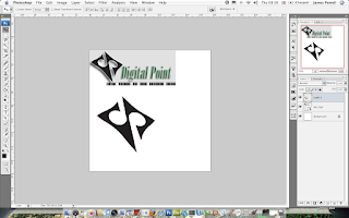
Creating a Web 2.0 Logo From an Exisitng Logo
Step 5)

Enlarge and position on the canvas. I've enlarged the image so you can do some fine deatiled work. It can be repositioned later,
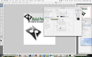
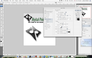
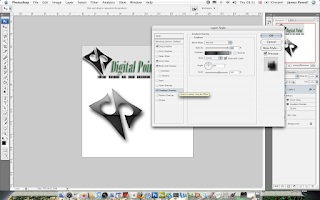
Creating a Web 2.0 Logo From an Exisitng Logo
Step 6)

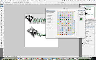
These steps are used to apply effects to the logo. If you download the Web 2.0 pack, you have some of the cool styles already included.

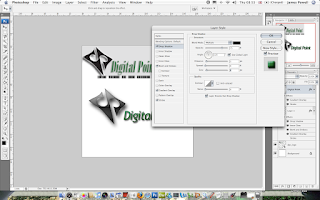
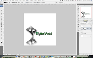
This step involved picking a cool layer style and adding some after effects.

Creating a Web 2.0 Logo From an Exisitng Logo
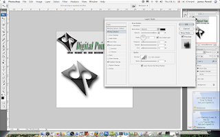
One thing that is predominantly used is a drop shadow. I prefer a large dark fuzzy shadow. You can change it to suit as needed.

Creating a Web 2.0 Logo From an Exisitng Logo
Looking good. Photoshop is great for this kinda of work. The next step to mimic the work is to add some text.
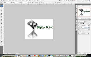
Step 7)

Web 2.0 text uses a lot of Trebuchet MS, Tahoma and similar sans serif font. Take your pick.

Creating a Web 2.0 Logo From an Exisitng Logo
Step 8)

Again use the Web 2.0 styles to add a layer style. Although this can be done manually having a preset style is quicker to do.

Again in the style of the original i've picked green.

Creating a Web 2.0 Logo From an Exisitng Logo
Step 9)

Again add a small drop shadow to add effect.

Creating a Web 2.0 Logo From an Exisitng Logo
Step 10)

This step is a little tricky if you haven't done this before. This involves creating a reflective drop shadow.

First select and duplicate the layer.

Creating a Web 2.0 Logo From an Exisitng Logo
Step 11)

Reflect the layer vertically and position underneath the original. Slanted logos always look good in this configuration.

Creating a Web 2.0 Logo From an Exisitng LogoStep 12)

Apply a black to white gradient to remove parts of the image. Go Layer > Layer Mask > Reveal all. Added areas of black remove parts, white stays the same.

Creating a Web 2.0 Logo From an Exisitng LogoStep 13)

This is an optional step which you can do later. Crop the image to a more suitable size.
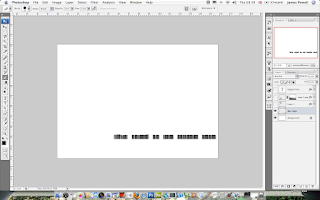
Creating a Web 2.0 Logo From an Exisitng Logo
Step 14)

One of the little features of the original was the little black bars. These are copied from the original although if needed by they could be recreated. Position as necessary.

Creating a Web 2.0 Logo From an Exisitng Logo
Step 15)

The effects look cool. Although with time this could be improved such as the outline of the image It isn't a bad job for 10 minutes work.
Digital Point Logo

Amazing Coloured Water

Hey

My friend recently sent me these amazing photos, of coloured water. Over all there is over 20 different pictures.

You can download the whole pack here.

Amazing Coloured Water
Amazing Coloured WaterThere is even more than these in this pack.

Creating a Modern Business Card.

A business card is an extension of your self. It is a little piece of you that you give out. In this tutorial I am going to show you how to create a stunning business card to remind people of who you are.

This tutorial will involve Photoshop although it can be done on any application. Click on any of the images for the full size version.

Step 1)

The first step is to set up the business card size. The average size for a business card is 3.5 inches x 2 inches (length x height). You can use any size you want.

Suitably name and save the file.

Step 2)

The first step is to create the front of the card. Use a suitable pastel colour. I've chose blue as that is my favourite. The next step is to add some text. Again going with the modern theme i've chosen Trebuchet MS, any suitable substitution will do.

Creating a Modern Business CardStep 3)

For most fonts, the normal spacing doesn't look quite right. Using the character pallet tool in Photoshop squeeze the characters together. A good compact finish is what is being aimed for.

Creating a Modern Business Card
Step 4)

Most business cards have more than just a name. I've added my website, although you can add anything you want. Phone numbers, address be creative.

Creating a Modern Business CardThe colour I have used is a grey that blends into the background, you want it so you can read as see the text but isn't the most striking feature present.

Step 5)

With the lines guides shown (the light blue lines) you can see that the text characters are not fully lined up. Again using the character tool move the character spacing to a suitable size.

By having the characters lined up the name looks more eye catching, and well designed.

Creating a Modern Business CardYou may have to split up your names into separate layers to be able to align the names correctly.

Step 6)

The next step is to add some sort of logo or widget to the front of the business card. This serves as a graphical representation of you. This could be your personal logo or a shape.

I've picked by creating some circles with different colours inside them. Using the shape tool, these were drawn onto the page.


Creating a Modern Business Card
Different layers were used for different colours.

Creating a Modern Business CardAs you can see the final piece of the card looks interesting as well as modern. The next step is to move onto the back.

Creating a Modern Business CardStep 7)

The back of the card needs to have as much white space as possible, as most people will write notes on the back, filling this up with colour and images doesn't help.

The back of the card needs to be as simple as possible. Again I have used the font from the front and suitably spaced it as required. The simple shapes that were created are used again, but smaller.

Creating a Modern Business Card
If you click the images you can see the full versions.

Creating a Modern Business Card
As you can hopefully see the business card does look stunning as is very effective. Overall this would have taken me about 10 minutes to create.

If you want more ideas for business cards you can see this post here.

Amazing Widescreen Wallpapers

Recently I posted about HDR Wallpapers and although i like them they are not every ones cup of tea. So I searched my hard drive and the internet to find interesting wallpapers for your desktop. Most of these are in wide screen format but will probably scale nicely. You can download the whole pack here.

Below is a sample of what is included in the 60+ in the download.


Amazing. You can download all of them here.


Wallpaper Wednesday - Nebulosa

Hello

Each week I am going to bring you an interesting wallpaper. These are only picked for there up most importance at creating a spectacular wallpaper for your Mac or PC.

This weeks is called Nebulosa


Click for Fullsize

Firefox and Thunderbird Logos as Vectors

I was a bit bored today and had an idea. Wouldn't it be cool if the FireFox and Thunderbird logos were vectors. So I created these:

Firefox and Thunderbird Logos
Click to Enlarge

The files are .dfx so they can be opened in any CAD / Vector program. Illustrator, AutoCAD.

If you want to download the files, you can do what you wish with them, but please link them back to me.

The file is located here.

If you want to use FireFox please use the link on the right.


Creative Commons License

This work is licensed under a
Creative Commons Attribution-Noncommercial-Share Alike 2.0 UK: England & Wales License.