Showing posts with label Download. Show all posts

Go Media's Arsenal Of Amazing Vectors

Hey

I like to use Vectors a lot. They offer superb quality. You don't, like with many stock images, get rough lines or pixelated edges. As a result they can be scaled and used for virtually anything. This post today is going to be about a vector site which offers fantastic quality vectors for extremely cheap prices. Call Go Media's Aresnal they hold some of the best vectors around. I'm going to go through some of the packs today in this post, and show you what you can get. You will be amazed.

The Sets

Go Media has divided the vector arsenal they hold into 8 outstanding sets. Each set contains 7 or 8 smaller packs (these can be downloaded individually). The prices range from $15 for the individual sets and $50 for a complete set. You can pay over $350 for every single vector they own. There is a couple of thousand for every single one.

Whats In The Sets?

Each big set is split into small subsections which contain a vector file with all of the individual shapes and vectors contained on it. I will take set 6 as an example of what is included.

If you decided to buy vector pack 6 you get a downloaded zip file of 16mb. In this file there are 7 eps files. Eps files are a standard export of Vector files, they contain all of the information which can be used in Illustrator or any other vector program. Even Photoshop can handle them.

Each of the 7 files contain all of the individual vectors which you can copy and paste to your your work. Each of the 7 .eps files is on a different theme. You can buy each of these theme packs separately but you don't get the multi buy discount.

Contents

As I am focusing in on set 6 I will show you the specific contents of the vector set. All of the other sets are similar, they just contain different vectors. Set 6 contains:

Line Work

If you have every tried to make very detailed lines within Illustrator you may find that it becomes difficult. Problems usually arise trying to get all the lines perfectly lines up. Save your self some work.


Radial

Very similar once again to the lines these are fantastically detailed spirals and circles. They make great backgrounds.


Heraldry

Anyone wanting to do something medieval or wants to simply use dragons, lions, eagles, crowns, feathers, etc. This is an amazing pack that has a lot of detail. The only down side is they do lack in number. You only get 22 compared to the other packs which contain a lot more.

Destroy 2

As the packs are designed to follow on from previous installments this is the second type of pack with the in a similar nature. I would personally have named this grunge, as it is very grungy, dirty and distressed. Used best for overlaying on art work. They add cool texture. A very versatile pack.

Skylines

Ever need a skyline to set off that city background? This pack is probably what you need. Based on New York City, Cleveland, San Diego, Atlanta, Boston, Philadelphia, Houston, Dallas, Detroit, Chicago, Los Angeles, Minneapolis, and Miami (although I can tell the difference) they add a fantastic skyline feel to any piece of work.

Scribbles

Surprising difficult to make. The scribbles pack is just that, scribbles. The .eps packed with over 50 different scribbles can be used for nearly anything. Although they may not seem useful they can be used for nearly anything. They contain a nix of grunge and illustration you can find many uses for them.

Anatomy

Probably the most detailed of any set this set is all about the anatomy of a human. It contains vectors on spines, bones, hands, feet, heads. All sorts. If you need a piece of human to set of a piece of work. This vector pack is definitely the one you want.

How They Come

So you have download the vector pack and you have parted with your money but how to they come? Each and very one of the vectors will be on a vector file. You can then pick the one you want copy it to your clipboard and use it as you please. I will be doing a more detailed post on how to use vector packs in the future.


Want Some Free?

No site would be anything if you couldn't sample there offerings. If you want to download a sample vector file, similar to the one above head over to the Freebies section. They have a free vector pack which contains a small sample from every single pack. Really useful as you can see the level of detail they contain.

Conclusion

Go Media's Vector packs are definitely the best ones around. They offer a superb quality for a very cheap price. I would urge you drop buy and check out there products before even considering looking anywhere else.

Cool Places For Illustrator Vectors

I've dabbled in Illustrator for a bit and it is one cool program. One of the defining points with this program is, of course vectors. But there most be some places on the internet where you can get really cool places to get cheap or free vectors to use in you work. Work of the highest quality is a must.

Place number one is Bitbox. One of my favourite blogs for design. The guy who runs the show has made up some cool vectors which you can download all for yourself. How nice. Anyway one of my favourite vectors that he has made is the Modern Arrows (Pictured Below) you can download it here and you can find the rest by searching through his site as it is always updated with new vectors which you can download.


The second place that is really cool for vectors is Vecteezy. Home of the stupid name cool vectors there are some amazing vectors that are located here. They are all free (like the previous one) and range in quality to the OK may be if i'm bored to the super cool I can't believe this is free. So if you want to check out this site it is certainly worth it.


The next one on the list is one of my favourite places for buying materials for both Illustrator and Photoshop and this is Graphic Xtras. They offer hundreds of different materials which you can download for a small charge. For example for $15 or £9 you can get this (tinyied because its breaking my input mechanism) really cool little pack that contains 13 high impact designs which you can use to create thousands of designs (one shown below). Although you get them free this is the place to get the ones at top quality.
If you want to splash out you can always pay some proper money for 25 Volumes of thousands of professionally vectors. There price reasonably at $90/£60 so if you want some pro vectors to use in you work this is the place to get them. They are available for Mac and PC respectively.

Ok, the next site is another of my favourite design sites which offers again some free vectors. There are hundreds of different vectors which you can download. The site is called Web Design Blog and like many sites it is all about design. If you want to sample the vectors which you can use you can find them here.


If you have been on the internet at all you have probably heard of deviantART.com one of the top places for arty stuff. A bit like Vecteezy they vary in quality but you can find some really cool stuff on there. So if you hunt around and search you should be able to find some cool vectors which you can use. Nearly all are royalty and other stuff free. So go to here to check them out.

If you find any more cool sites to download vectors please post them in the comments.

A Video Of A Photoshop Drawing Being Coloured In.

Hey

This may or may not be a regular update, I don't no, but what I have for you is another video of me colouring in the latest cartoon. Again this was done on Photoshop this took slightly longer than the previous video, the original was 45 minutes in length.
If you want you can download the source files to use at your own devices. They are located here.

Creating a Website Badge - Photoshop

Hey

This is another tutorial which uses Photoshop and it shows you how to make a cool retro style badge for you website. With a lot of time and effort you can make this look amazing.
For this tutorial you will need:

Photoshop or Similar
Time
Optionally the source pack located here.

If you are read lets begin.

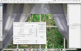
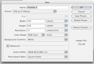
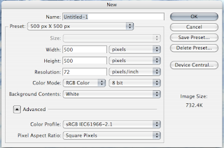
Step 1) Create a good sized canvas, I picked 500 x 500 pixels. You can pick any size you want just don't make it to small.

Creating a Website Badge - Photoshop
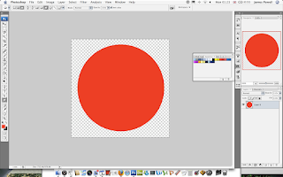
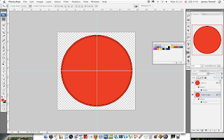
Step 2) Create a red (or any other colour) circle in the center of the canvas don't let it touch the edges, leave a little room. Its best if you set the background to a new layer and set the background to zero transparency. I think it helps you work with the layers better.

Creating a Website Badge - Photoshop
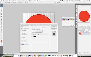
Step 3) Add a 2 pixel Stroke to the circle you just drawn. If you have a bigger canvas use a larger stroke, small canvas your stuck at 1. A bigger canvas lets you fiddle around with the layers more.

Creating a Website Badge - Photoshop
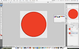
Step 4) Duplicate, shrink and position the layer so you have a double boarder. There is probably an easier way to do this, I just can't find it.

Creating a Website Badge - Photoshop
Step 5) One hand tip is to create a cross with the ruler guides so you can align the center of the circles.

Creating a Website Badge - Photoshop
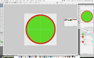
Step 6) Add a green circle on a new layer, and again add a Stroke.

Creating a Website Badge - Photoshop
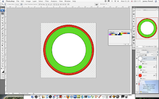
Step 7) Finally add a white inner circle on a new layer. A stroke will be used as a boarder image.

Creating a Website Badge - Photoshop
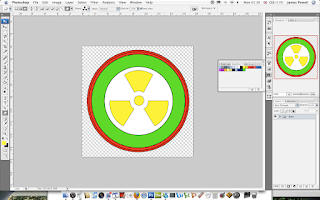
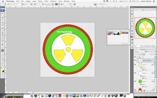
Step 8) Add an interesting image in the white area. Apply a white stroke if the shape calls for it.
Creating a Website Badge - Photoshop
Step 9) Add your website name in the style and colour of what you want to use.

Creating a Website Badge - Photoshop
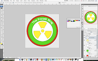
Step 10) Warp, bend and transform the font until it lines up with the curve of the circle.

Creating a Website Badge - Photoshop
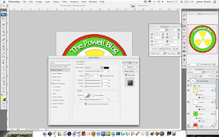
Step 11) One final touch is to add a layer effect to the text. This is optional, but it adds and extra level of detail.

Creating a Website Badge - Photoshop
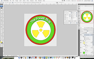
Step 12) If you want to use the image again you can put all the layers into folders, it keeps them all organized. If you are happy to use the image, flatten or directly export the image.

Creating a Website Badge - Photoshop
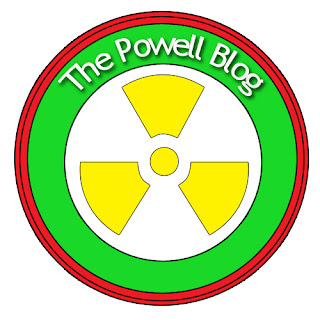
You have a cool looking website button created in Photoshop. You can find the The Powell Blog here.
Creating a Website Badge - Photoshop
With a lot more time you can make some amazing effects. Please leave a comment to you creations.

Japanese and Wire Brushes

Hey

I'm all into creating photoshop master pieces at the moment. A good set of brushes can really help. I've found a couple that are of great use while searching the internet. These are mostly Japanese style foliage with a couple of wire styles thrown in.
The image is an example of what is included.

Japanese and Wire BrushesYou can download it here.

Creating a Web 2.0 Logo From an Exisitng Logo

Hey

This tutorial is going to show you how to change any exiting logo into a cool Web 2.0 style logo. This is with cool gradient styles, reflections and interesting text.
For this tutorial you will need Photoshop or similar and and an existing logo (or the one provided). The Web 2.0 pack may also be useful to use, you can download it here. At any of the image you can click on them to see the full sized image.

If you are all ready and seated, lets begin.

Step 1)

The first step is to create a canvas. I use a default 500 x 500 pixel size. A large size should suffice.

Creating a Web 2.0 Logo From an Exisitng Logo
Step 2)

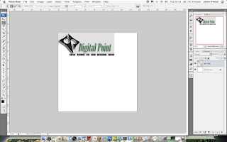
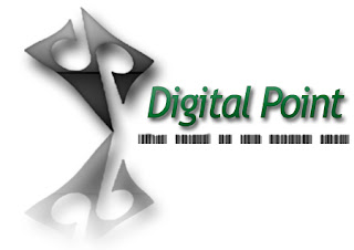
Once you have your canvas find you suitable pre Web 2.0 logo. I've used Digital Points logo. Although any similar style logo would do.

Creating a Web 2.0 Logo From an Exisitng Logo
Step 3)

Place or copy this into the canvas. This would be used as both a reference and suppling some of the shapes used.

Creating a Web 2.0 Logo From an Exisitng Logo
Step 4)

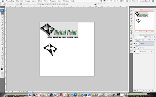
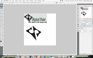
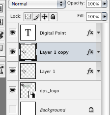
Use the magic wand or the marquee tool to select the logo. In this logo it is the black shape on the left. I've copied this onto a new layer.

Creating a Web 2.0 Logo From an Exisitng Logo
Step 5)

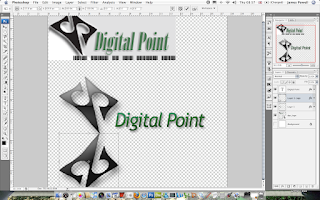
Enlarge and position on the canvas. I've enlarged the image so you can do some fine deatiled work. It can be repositioned later,

Creating a Web 2.0 Logo From an Exisitng Logo
Step 6)

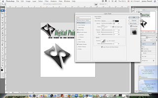
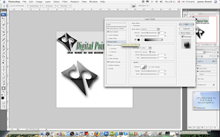
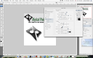
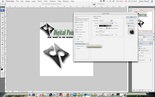
These steps are used to apply effects to the logo. If you download the Web 2.0 pack, you have some of the cool styles already included.

This step involved picking a cool layer style and adding some after effects.

Creating a Web 2.0 Logo From an Exisitng Logo
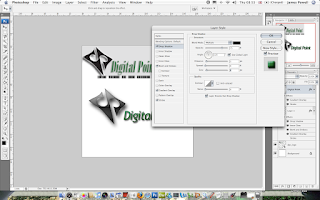
One thing that is predominantly used is a drop shadow. I prefer a large dark fuzzy shadow. You can change it to suit as needed.

Creating a Web 2.0 Logo From an Exisitng Logo
Looking good. Photoshop is great for this kinda of work. The next step to mimic the work is to add some text.

Step 7)

Web 2.0 text uses a lot of Trebuchet MS, Tahoma and similar sans serif font. Take your pick.

Creating a Web 2.0 Logo From an Exisitng Logo
Step 8)

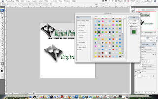
Again use the Web 2.0 styles to add a layer style. Although this can be done manually having a preset style is quicker to do.

Again in the style of the original i've picked green.

Creating a Web 2.0 Logo From an Exisitng Logo
Step 9)

Again add a small drop shadow to add effect.

Creating a Web 2.0 Logo From an Exisitng Logo
Step 10)

This step is a little tricky if you haven't done this before. This involves creating a reflective drop shadow.

First select and duplicate the layer.

Creating a Web 2.0 Logo From an Exisitng Logo
Step 11)

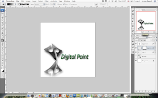
Reflect the layer vertically and position underneath the original. Slanted logos always look good in this configuration.

Creating a Web 2.0 Logo From an Exisitng LogoStep 12)

Apply a black to white gradient to remove parts of the image. Go Layer > Layer Mask > Reveal all. Added areas of black remove parts, white stays the same.

Creating a Web 2.0 Logo From an Exisitng LogoStep 13)

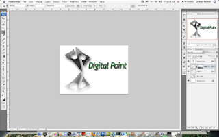
This is an optional step which you can do later. Crop the image to a more suitable size.

Creating a Web 2.0 Logo From an Exisitng Logo
Step 14)

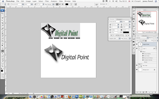
One of the little features of the original was the little black bars. These are copied from the original although if needed by they could be recreated. Position as necessary.

Creating a Web 2.0 Logo From an Exisitng Logo
Step 15)

The effects look cool. Although with time this could be improved such as the outline of the image It isn't a bad job for 10 minutes work.
Digital Point Logo

Creating A Web 2.0 Label

Hey

This tutorial is all about creating and interesting and effective label which you can use to advertise parts of you website. For example you could place this above new content. To see the full image click.

For this tutorial you will need photoshop or similar, and the Web 2.0 layers and gradients pack which you can download here.

Step 1)

Create your canvas, I suggest a large size so you create lots of detail, the final image can be scaled down later.

Creating A Web 2.0 Label
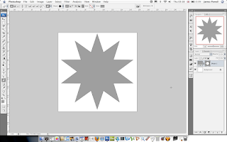
Step 2)

The next step is to draw your shape, this can be any shape. Use the preset shapes in Photoshop or download some new ones off the internet. It doesn't matter what colour it is.

Creating A Web 2.0 Label
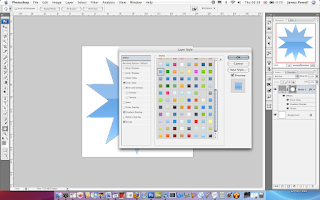
Step 3)

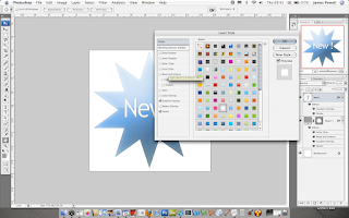
Next apply a layer style to the shape, I recommend using the Web 2.0 layers and gradients pack, here. Although you can make your own.

Creating A Web 2.0 Label
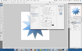
Step 4)

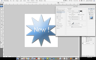
As well as this I suggest using a bevel and emboss. Use are large size and reduce the opacity of the shadow.

Creating A Web 2.0 Label
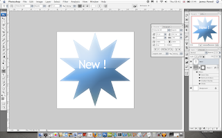
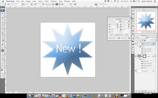
Step 5)

Add you text. I've used Trebuchet MS. Use the character palette to move the letters into a good looking spacing.

Creating A Web 2.0 Label
Step 6)

Again, use one of the white layer styles in the pack and apply this to the white text.

Creating A Web 2.0 Label
Step 7)

You now have a cool looking Web 2.0 label to add to your web pages.

Creating A Web 2.0 Label
Step 8)

One optional step that I suggest adding is a drop shadow, this adds a lifted effect to the label.

Creating A Web 2.0 Label
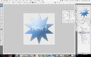
Step 9)

Flatten and remove the background and save as a .png. This can now be added to any web page.
Creating A Web 2.0 Label
The final label.
Creating A Web 2.0 LabelAs you can see it looks great on any web page.

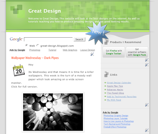
Creating A Web 2.0 Label