Showing posts with label Website. Show all posts

I've Released A New Site

Hey

This is just a quick post to say that I have released a new site. Its call Mac Tricks And Tips, and if you havn't already guessed is all about Mac Tricks And Tips.


I have spent a lot of time developing and messing about with the design and layout of the blog. It took me a long time getting the composition of the design right. The result have come out great. I've decided to do a Mac on since I love Mac's and use them all the time. I wanted to post and share all the tips and tricks I have found and developed over time and share them with people.

In the mean time expect a cool tutorial on designing a magazine cover. I was planning on doing it today, but it took a lot longer than planned. As a result I am going to have to push it back.

Amazing Blogger Design

Hey

I like blogger, it is simple, easy to use and very easy to implement designs. Anyway, I was really impressed by this blogger design. Its simple clean and has a couple of cool little features which make it stand out. Anyway if you head over to jackbook, you can check out the details about the "iWork" theme. I like it and I thought I would share.

Cool Place To Get Labels

Hey There

While searching the web as usually during a small period of free time I have, I came across a really neat website. Since this website is all about design I thought I would share something that could hopefully help your design skills and products. The website I am talking about is Frontier Label. This website has two great things that made me write a post about it. One the cool product, which are labels and two the website.

If you don't know the process you create your own artwork, upload it and then send it off to be turned into a label. I must say the prices are expensive, around $250. But these are about 2x3 inches minimum sizes. So you do get what you pay for, for your $250 you do get around 250-300 labels, so the price does work out. But you don't have to stick with your basic 2x3 inches. You can make a label that can be any size, this will of course be really cool to stick on places. You could make a funky design to advertise your services or just make people laugh. You could make the next viral image on the internet with your label on it. Better yet you could get your own bumper sticker for $658 for 1000 and do something like I Park Like An Idiot.com. The possibilities of labels are endless.

Another cool part of this site is the layout design. I usually like two things when I want to buy from a site. The products (duh!) and the site. I don't know why but this site just feels cool and well made. It has a lot of cool things such as online quoting which you can mess about with an really see how cheap (or how expensive) you can make it and I really like the colour scheme, it just seems to work well.

Anyway I just thought I would share it with you. These do seem like quality printers, which use quality stock. I don't think they will let you down. You could go for a cheaper place, but then you may not get the best quality and a quick next day delivery if you chose to opt for it.

Cool Website Feature - Lightbox - And Implemented

Hey

I always like cool little features that are present on websites. It makes them uniques or very cool when they are implemented correctly. One of theses such things is a bit of CSS and javascript that is used to create a "lightbox". You may have seen it on your internet travels. lightbox is a bit of code that opens an image on the page in its own little div elements. As well as this the background is blacked out to a certain level. I think it is really cool, so I decided to share it with you. An example of the lightbox is shown in the image below.


If you want to try it out you can go to the lightbox webpage and download the all the code. There is an earlier version that can be used but it doesn't look as cool. I have also added the code on this website and if you click on the image below you should be able to see the test in all its glory. It takes a couple of seconds for the image to load. If you do get impatient just click the loading icon and it should close the image overlay.


I am not going to be able to make every image lightbox compatible as I would have to go through every single page and image and change some of the code. But I will do it on most of the images I post from now on.

Just as a final note I would like to say kudos to GeckoandFly and some page.

Elite By Design - A Website To Check Out

Hey There

While search the internet I came across this cool website Elite By Design. It is a simple website, updated regularly, which gives you loads of different tips and tricks, on nearly everything. I like visiting it, I have found some really cool tricks from viewing the articles he has written. It is a really clean website and I think it is great. He also wrote about me, so its good to return the favor.

HavenWorks - The Worlds Best Designed Website

Hey

I've meant to do this post for a long while, it was only recently by looking through my post-it notes have I remembered to do it ( I should have used a task manager). This little website gem is probably one of the worst design websites on the internet. I was being sarcastic by the title if you haven't realized. HavenWorks, I think, by the massive amount of information on one page, is about something to do with politics especially stuff about elections.

To make this post longer and to point out the fact that there is many areas that could be improved, I will do a short list of the problems with HavenWorks.

1) It seems to be one page. There might be more, there is slightly to many links to find out.
2) They clearly don't have a sidebar. Many web design guru's would be having a fit.
3) Slight over use of web safe colours. People monitors, I think, can cope with the 16 million colours that are available.
4) Overuse of mini-icons.

Anyway, enough bashing of HavenWorks. This post was design to be a little light comic relief. Below is attached an image of the website. I wanted to do the whole page using screen-grab, but for some reason it never wanted to save. The page must have been to large.

Advertise On Great Design

Hey There

I've got a bit fed up of Google Adsense at the moment since it isn't paying out very well. As a result I want to set up some direct advertising. It isn't going to cost the earth and I will show you a couple of funky shiny graphs and lots of maths with big numbers to try and get you to place down your hard earn money.

What You Get

All adverts on the site are 125px x 125px. The adverts are placed in two different places. At the bottom of every post or on the left hand side in the sidebar. These are priced at $10 or $15 per month respectively. There are two different places since the sidebar image is displayed on every page but the cheaper priced option only appears in the blog posts.

At the current statistics there are 38,000 page views and 24,000 visitors as shown in the image displayed below (click for the fullsize image) per month.


As a result you get a very cheap cpm (I can't work it out at the moment since my calculator has broken). For people who are interested in page rank and seo my blog is currently rated at pr 3 although I expect this to climb in the next rank update.

The Rules

There are a couple rules which you should abide by. No adult related links. I like to see this blog as family friendly. Porn is not family friendly material. Graphics should be supplied in .jpg .gif . png and .bmp. You can have animation but it should be simple and is subject to approval. I will review your website and graphic so make sure it works. There aren't many rules so try and stick to them. Payment is by PayPal and is to be paid in advance per month.

Ok Give Me The Spot

If you want to advertise on Great Design you can drop me an e-mail at jamespowell100@gmail.com prices are $10 and $15 for either a blog post advert or a sidebar advert. You can have a combined discount of $20 if you pay for both. I'll be waiting for your email. Remember its a first come first serve basis.

Pingdom - Website Load Speed Tester

Hey

Its important for a web designer that a website loads quickly. Every remember the 4 second rule for websites? If a website doesn't load (or nearly all of it) then a user leaves. Most of the load time depends on a server but a lot of it can be sped up by finding out what time it takes for things to load. To enable you to do this quickly and effectively, this tool pingdom, is perfect.

What the tool does, is analyse the load times, from first connect to the last byte, of every element on your website. It the presents this in a a cool graphical manner for you to analyse and find out what is happening in terms of time.


This tool is really great. For example from the above graph I can see that one element of my site is taking a really long time to load. This can then be debugged and changed in my code. A better example of this was the reddit widget on my site. Before I found and used this tool, my site would take ages to load, over a couple of minutes. This code helped a lot.

I would definitely check this site out. Its is a really good tool to have in your design arsenal. Pingdom.

A Good Place For Design Tutorials

Hey There

One thing that I like to do in my spare time on the internet is find and do Photoshop tutorials by other people on the internet. One of the best places i've found is Good Tutorials.


This site is a collection of user submitted tutorials, that are some of the best around. Each tutorial which is submitted goes through a moderation stage of 5-7 members. As a result each tutorial is top quality and you don't get the spam ones falling through. I really like it. Many of my tutorials can be found on the site. So check it out.

VectorMagic. A Cool New Tool.

Hey

There is a really cool new tool out on the internet that can be used to help you vectorise any image. It produces really interesting and accurate results and is a lot better than the ones used by Illustrator. This new magical tool is called Vector Magic.

This online tool is designed to turn any inputted image into a vector image. Its very simple to use and the results can be retrieved off the server in under a couple of minutes. The engine works best with simple image with few colours. I've found that these result have come out the best. Photos which can also be upload, can be turned into vector but usually result in very jaggy edges between each of the paths.

There are only a couple of options to pick when uploading an image. Low, Medium and High. Low as the name suggests is done the quickest but produce the worst results. This isn't necessarily bad, if you want a quick starting point to work from. Medium and High do produce very accurate results. The high option usually results in hundreds of paths and shapes on your canvas. This can be useful if you want a very detailed image but is a pain if you want to edit your image afterwards.

Check it out see for yourself how it works. I'm sure you will be able to find a use for it. Vector Magic.

Going Away For 4 Days

Hey

This is just a quick post to say that I am not going to be hear for the next couple of days, I am going away to prague for a short trip. I'll take lots of photos, and share the best ones with you. Don't be to lonely while I am away.

See you soon.

Mistakes Made In Website Design

Hey

Websites are a big part of my life. I spend a lot of time using them, so a good design is a must. I know i'm not the master of web design but I do know what is good and what is bad. This post will be about the common mistakes that I personally think are made in web design and possible a reason why.

1) The Website Takes To Long To Load

There is a general consensus that websites have about three to fours seconds to load on a broadband internet connection before a user gets bored and visits another website. This mistake is usually caused by designers putting large images in there layout or flashy graphical elements. They do look sweet but if it loads slowly I can find my content else where. For extra reading check out this BBC news article about website shopping and the four second cut off point. The same principle applies to nearly any website. The only pages I do let load are ones with video, where the video is the last thing to appear.

2) The Navigation Changes.

A website where the navigation bar changes depending on which part of the website you are on is great in theory but it doesn't really work. For example small changes such as if the page you are on is "Tutorials" and the tutorial link is diminished, this is fine. But if the whole navigation bar changes it confuses new users and people begin to find it difficult to find particular parts of your website.

3) Broken Links

When I come across a website and I click a link and it comes up with a 404 error or similar, this really annoys me. If you design a website and I can't get to the page why both putting it in there. It doesn't take long if you, or a group of you, to check your site for anything that is broken.

4) None Standard Links

This mistake sort of blends in with number 3. A link on a website should be a colour, preferably blue, and have a small underline. The biggest mistake is when designers change the colours or blend the link in so much that I don't no its a link. This is confusing. Links which are images are not to bad as long as the image relates to the link. A check out link should be a little shopping basket, this is good design. A bad mistake is when, say for example, a fruit website uses a banana to link to the check out, or an apple to link to contact information. Its confusing and bad design.

5) No Target Audience / Doing To Many Things

A website should be ideally focused on one or a couple of topics. This way a user knows exactly what the website is about. Bad design comes manly when a designer or client wants the website to do everything. Nothing gets done well and it is all a bit glossy. A well designed websites wants to have a specific purpose and target audience.

6) Crazy Colour Schemes

Mixing green and black may look good on paper but it usually doesn't on the web. How many times have you seen a Myspace page or kids website having green text and black background. Not all web designers use such drastic colours but i've seen some colour schemes that are best left alone. "My EYE'S!"

7) Best Viewed In / Doesn't Work In Other Browsers

You see in some website design a small piece or text or image that says "Best Viewed in Internet Explorer 7 and 1024 x 720 Resolution." This is really bad. I don't personally care if you website is best viewed in 1024 x 720 resolution I want to view it on my 30 inch wide screen monitor and I want it to look good. If it doesn't work in any other browser, this should have been checked. On the internet people view websites in hundreds of different ways. It should work on all. I know there is a gripe that some websites only work in IE and not Firefox. I think this is the worst kind of web design when a site is browser specific.

8) Too Many Pages To Click Through

Some websites do need users to click through a couple of websites, such as when you are purchasing a product. But I should not be there all day. If a website is designed that I have to click on 50 links to get what I want, its not well designed. For example check out this post, about the 16 steps to buying / transferring a product from Godaddy. It may seem good on paper but it doesn't work in reality. It should be as quick and painless as possible. To many pages to do something simple. Bad Design.

9) Crazy Amount Of Adverts

I know websites need to use some sort of advertising based income to subsidies the site, but it doesn't need to be crazy. For example I personally think a website should have only a couple of adverts. I'm not a bigger fan of adverts to start with and use Adblock frequently. But if a website does have adverts they shouldn't clutter the page. Over use is; pop-ups and pop unders, a column dedicated to just adverts, at the top and bottom of the page, in every fourth line of your post. Over use takes the user away from the content and pisses them off. I know I have adverts but I don't think there intrusive. I also don't earn very much from them.

10) Splash Pages

Nearly all of the time, splash pages are a website of time and space. There are off course places to put such pages. For example gambling and pr0n, where I think it is required by law but now where else. The reason splash pages are of bad design is people just look for the skip button and don't look or use the splash page. They are not needed.

Bonus

#1) Spelling Errors

Although this is not a big mistake, spelling errors are annoying. I don't mind the odd error, I seem to make them all the time. But if a website contains hundreds of spelling and/or grammar errors it tells me that you are not interesting in your site. This is gives me a bad impression and I will probably not return.

#2) No Contact Information

Although this isn't a major error in website design it does become a little annoying if I want to contact you about your product, service or to suggest something. Having no contact information says to me that you can't be bothered. A little bit of information goes a long way. For example I've been contacted numerous times and i'm happy to respond and talk to people.

I think i'll stop there. I could go on for a long while explaining the millions of mistakes that appear in web design. But 10 is a good number, plus bonus. If you have any more please leave them in the comments. And remember to have a good website design.

Cool Favicons

Hey

You see favicons all over the web. These are the small 16 x 16 pixel images that appear in you browser address bar or your tabs. But which are the coolest on the internet.
I think these are some of the best.

Candy Stand, The Black bits don't appear on the final make up. Simple yet effective.

ClickBank, A very stylish favicon.


Digg, Appears through out there site. Simple design.

ExtraLife, One of my favourite Cartoons, the favicon is a relation to this.


Radiotimes, This icon glares out at you, simply showing the cut down version of the sites logo.

Reddit, Again using the logo for the favicon, this scales well and it instantly recognizable.

Tv Links, Again simplicity at its best another great piece of design.
World of Warcraft Guides, So much detail in such as small space. Another good icon.

Well Designed and Funny Website Error Messages

Hey

You will probably have noticed by now that hen you miss type a URL or go on a website that doesn't exist you usually get a 404 page or similar. Some website leave it as a boring default, but some get creative and change the style and text.
Although many of these don't have that much useful information they are well designed and some are down right funny.
If you click on the image you will get a full size version. In no particular order:

1) TV Links
Well Designed and Funny Website Error Messages
A great website where you can get links to TV shows, this is a really good error message because it continues in the style of the website.

2) Google
Well Designed and Funny Website Error Messages
A bit boring and not as interesting as some, but the cool retro look is great.

3) Orkut
Well Designed and Funny Website Error Messages The popular myspace type site from Google, I just laughed at the first line.

4) Reddit

Well Designed and Funny Website Error Messages The only reason this is in the list is because of the sad space man thing (can't remember what it is called).

5) Torrentz
Well Designed and Funny Website Error Messages Dam hamster powered servers they just can't keep up. This is one of the funniest error messages around.

6) Apple
Well Designed and Funny Website Error Messages Probably the best 404 error message here. The only one that contains links to other parts of the site. A well designed error which you can navigate from.

7) Blogger

Well Designed and Funny Website Error Messages Again like Apple's this does give some sort of access to other parts of the site after the screw up, although not as much.

8) Digg

Well Designed and Funny Website Error Messages The big question mark definitely makes the point that you screwed up.

9) eBay
Well Designed and Funny Website Error Messages This again has a lot of navigational links for you to use. With a little descriptive error.

10) Fark
Well Designed and Funny Website Error Messages
The only reason this is here is because of the chipmunk thing. Very funny.

Creating A Web 2.0 Label

Hey

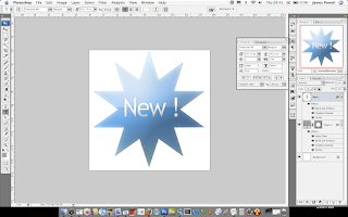
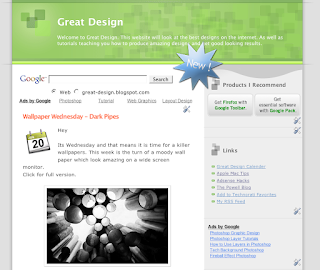
This tutorial is all about creating and interesting and effective label which you can use to advertise parts of you website. For example you could place this above new content. To see the full image click.

For this tutorial you will need photoshop or similar, and the Web 2.0 layers and gradients pack which you can download here.

Step 1)

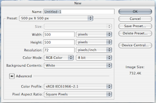
Create your canvas, I suggest a large size so you create lots of detail, the final image can be scaled down later.

Creating A Web 2.0 Label
Step 2)

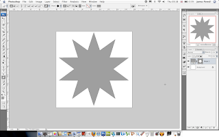
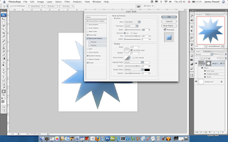
The next step is to draw your shape, this can be any shape. Use the preset shapes in Photoshop or download some new ones off the internet. It doesn't matter what colour it is.

Creating A Web 2.0 Label
Step 3)

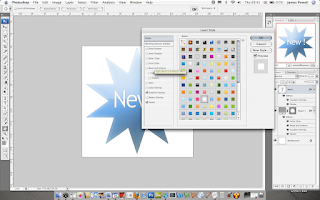
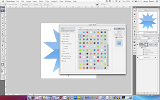
Next apply a layer style to the shape, I recommend using the Web 2.0 layers and gradients pack, here. Although you can make your own.

Creating A Web 2.0 Label
Step 4)

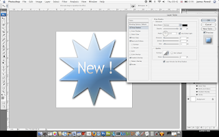
As well as this I suggest using a bevel and emboss. Use are large size and reduce the opacity of the shadow.

Creating A Web 2.0 Label
Step 5)

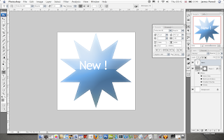
Add you text. I've used Trebuchet MS. Use the character palette to move the letters into a good looking spacing.

Creating A Web 2.0 Label
Step 6)

Again, use one of the white layer styles in the pack and apply this to the white text.

Creating A Web 2.0 Label
Step 7)

You now have a cool looking Web 2.0 label to add to your web pages.

Creating A Web 2.0 Label
Step 8)

One optional step that I suggest adding is a drop shadow, this adds a lifted effect to the label.

Creating A Web 2.0 Label
Step 9)

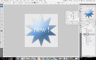
Flatten and remove the background and save as a .png. This can now be added to any web page.
Creating A Web 2.0 Label
The final label.
Creating A Web 2.0 LabelAs you can see it looks great on any web page.

Creating A Web 2.0 Label

Cool Icons Of The Web 2.0 World

Every time you visit a business or some times blogs website most of the time they have and eye catching logo or banner. These are know nowadays as web 2.0 logos. 2.0 being the second generation of the internet after the .com bust.

Below is a selection of the best Web 2.0 logos which I thought were some of the best out on the intertubes.

Website Grader

Website grader
One of favorite websites at the moment this logo is a real star at what can be done to show how cool a logo can be.

9Rules

9 rulesAnother cool logo, this one with a background image and plenty of colour, nothing is worst than a dark monotone logo.

Campfire
Camp fire nowCamp fire is business chat for groups, or so the description says. This logo is a top job for making something look interesting.

Designers Mind

Designers mindOne of my favorite design blogs, and this logo certainly does the website justice.

Veerle's Blog


 Veerle blog
An amazing website with a striking logo. Its one to be proud of.

Pando

 PandoThis websites the features of 3D and shading more than the previous, a very interesting logo.

Spongecell
sponge cell
Probably one of the only web 2.0 that utilizes, and object into there logo name. Again, funky looking and a great logo.

Shutterfly

shutterfly
What makes a striking logo is always little widgets or vector art that is used to add more interest to the text. The little colors and circles make this logo stand out.

Pingoat

PingoatOne of my favourite websites at the moment on the internet. This logo is fun and interesting to look at.

If you found any more cool looking web 2.0 logos, or want to share your views please leave a comment below.

Why Do eBook Sites Look So Bad?

You see them all over the web. Sites offering eBooks, that are of decent quality but are always let down from the type of website people land on. For example most of these eBooks are from Click bank.

Below is examples of these types of websites.

World Of Warcraft Joanas 1-70 Horde Guide

World Of Warcraft Joanas 1-70 Horde GuideYou can click for a full versions, or visit this link here. The problem with this website is that it is a whole website on one page. For example, there are testimonials, product review, etc. What could be done is split up the page into small sub pages, pretty much like a normal website.

This product may be the best in the world, and probably is since many people have reviewed it and said its worth the money. But the website, in my opinion lets it down, and is a real bandwidth hog for dial up users.

How To Write Your Own eBook


Again another ebook on the web which is probably a great download. Click the image for a full version or visit the full website here.

How To Write Your Own eBookAgain another really long page with no other links than a buy page and other minor pages that have no real value to the eBook.

The problem with this like the one is that it is to long. The result of this is that a person has to scroll a long way down before they get to a buy link. These probably results in a lot of lost sales as people give up on the page before they get to the bottom of the page.

Ultimate Gold Guide

Another World Of Warcraft eBook, I Like WOW, this is similar to the websites above but a lot better.

Ultimate Gold GuideYou can visit the website here. All though not that good because it has all the information on one page, it is shorter and a bit more specific.

All these websites could easily be improved if they added more links, create a more of a navigational system.

To summarize why these websites are not the best in the world.
  • They offer all there information on one page.
  • Hard to read some of the text.
  • Complicated layouts, to much information.
  • Background music (only on some)
Finally, I no that some of these products are good, and I would seriously suggest you should buy them if you think they would help you out.

Till next time, Good Bye.